
SaaS
Website Redesign
Nextiva.com is the primary digital platform for Nextiva, a business communications company providing cloud-based solutions including VoIP phone systems, unified communications, contact center software, CRM tools, and customer experience management solutions.
The project focused on a complete website redesign aimed at modernizing the visual identity, simplifying navigation, and improving clarity across a highly complex product offering.
I worked as a Senior Web Designer within a cross functional team, contributing to the redesign of core pages, layout systems, and UI patterns to create a more intuitive and conversion focused experience.
For
Nextiva
Role
Web Designer
Duration
~4 months
Year
2024.
My Role & Responsibilities
As a Senior Web Designer, I contributed to the strategic and visual redesign of Nextiva.com.
Responsibilities included:
- Restructuring page layouts and information hierarchy
- Designing modular UI sections
- Contributing to navigation simplification
- Creating high-fidelity UI designs
- Ensuring responsive behavior consistency
- Collaborating with development during implementation
- Participating in stakeholder review sessions
This redesign demonstrates
- Ability to manage high-content, high-complexity platforms
- Structural and systems thinking
- Conversion-aware design decision-making
- Cross-functional collaboration
- Scalable layout architecture
What I Learned
This project reinforced:
- The importance of structural thinking in complex SaaS websites
- The impact of visual hierarchy on conversion
- The necessity of balancing marketing goals with usability
- The value of modular systems in large-scale web platforms
Problem & Goals
Business Problem
Nextiva offers multiple communication and customer experience products targeting different business segments (SMB, mid-market, enterprise). Over time, the website became content-heavy and structurally complex, making it difficult for users to:
- quickly understand product differences
- identify relevant solutions
- navigate efficiently
- convert confidently
Redesign Goals
Modernize the visual language.
- Simplify complex navigation structures.
- Improve product clarity and hierarchy.
- Increase usability across device sizes.
- Create a scalable layout system for future content growth.
- Support marketing and conversion objectives.
Team & Collaboration
The redesign was executed by a collaborative team including:
- Senior Web Designers (including my role)
- Marketing stakeholders
- Developers
- Product and business teams
Weekly alignment meetings ensured:
- visual direction consistency
- content clarity
- technical feasibility
- marketing objective alignment
Collaboration with development teams ensured smooth implementation of
updated layouts and UI patterns.
Inputs & Constraints
The project operated within several constraints:
- Large volume of existing content
- Multiple product verticals
- SEO considerations
- Marketing-driven page structures
- Established brand recognition
- Cross-device responsiveness requirements
The redesign had to balance innovation with brand continuity.
Design Process
The redesign was approached systematically, focusing on structure before aesthetics.
Content & Structure Analysis
We analyzed:
- existing page hierarchies
- product segmentation
- navigation complexity
- content density
The goal was to identify friction points and simplify decision-making paths.
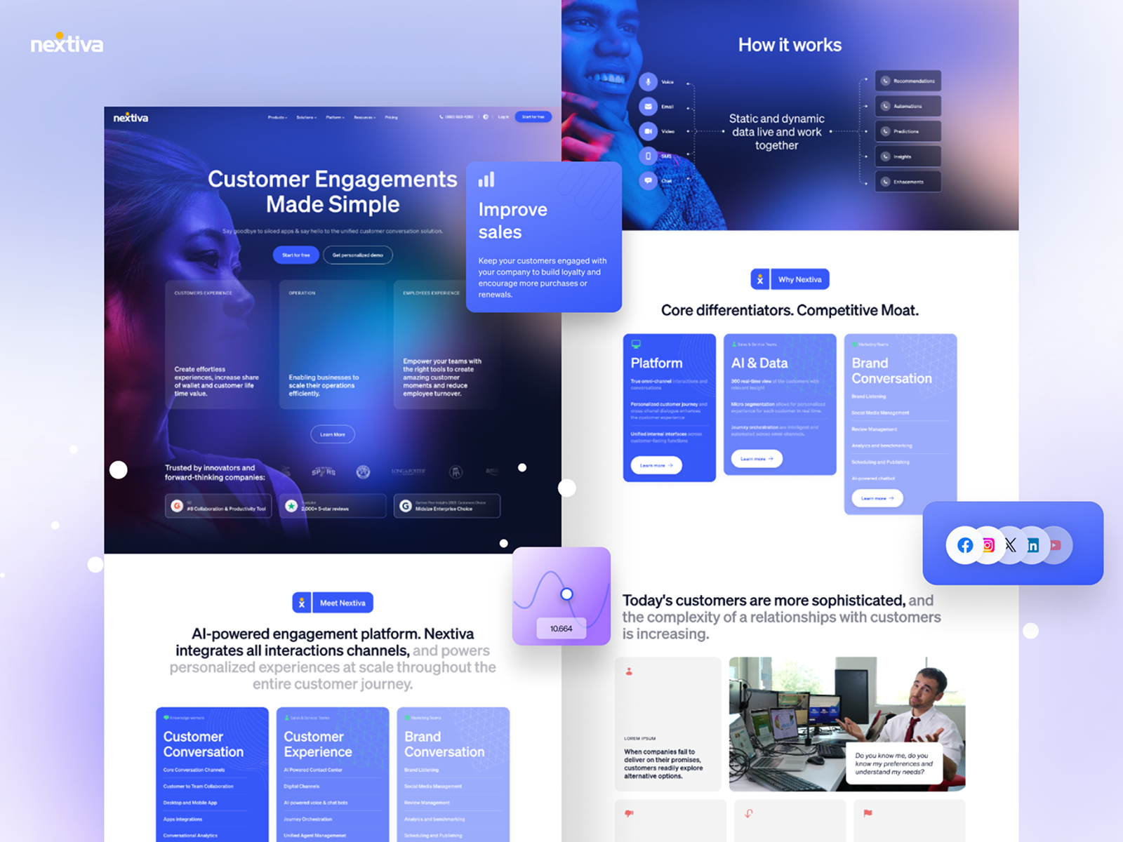
Information Architecture Refinement
Navigation was restructured to:
- reduce cognitive overload
- clarify product categories
- create clearer pathways to solutions
- improve top-level menu clarity
Mega menu structures and page grouping were optimized for better discoverability.
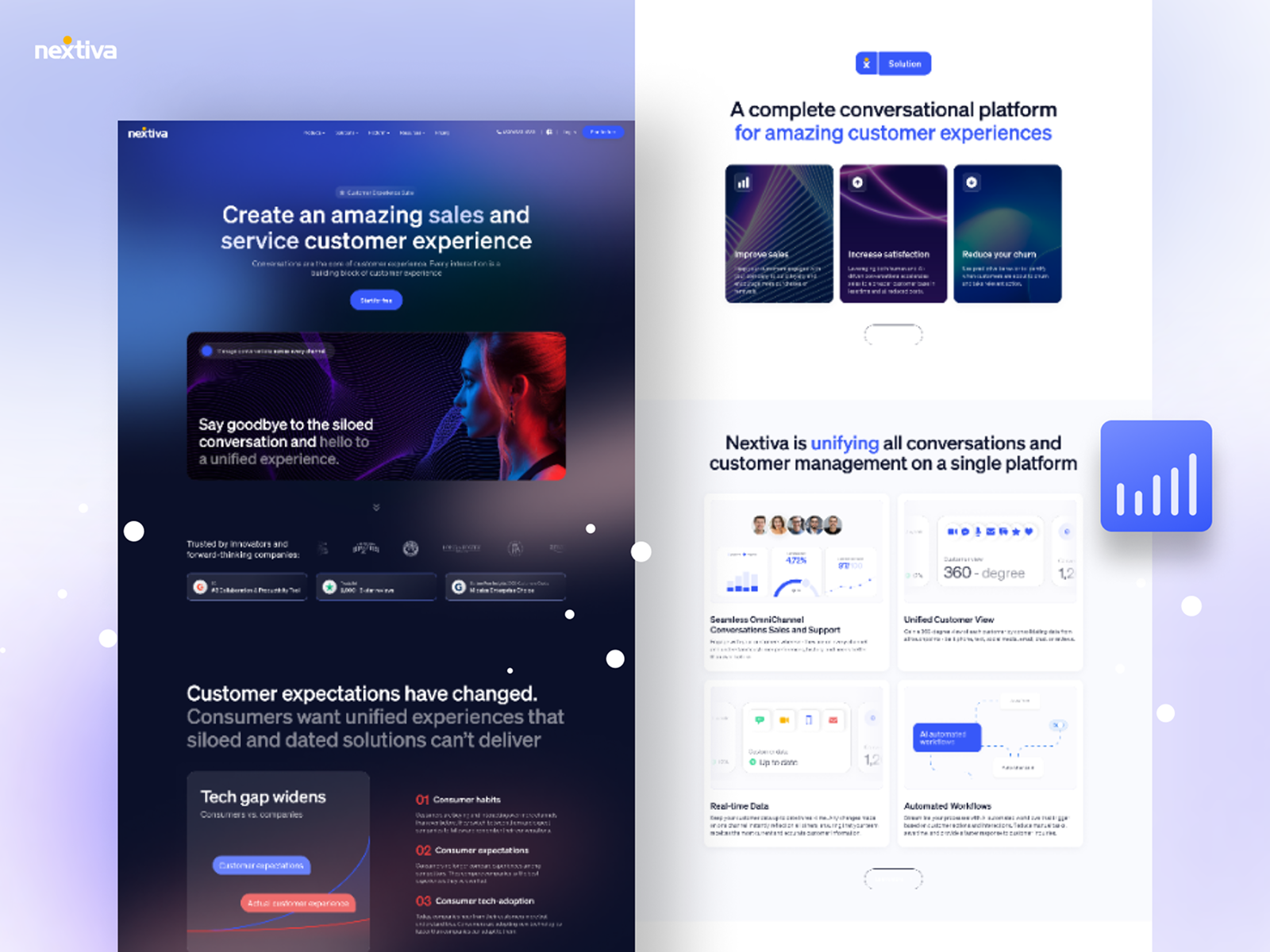
Layout System Definition
A modular layout system was introduced to:
- standardize section spacing
- improve visual hierarchy
- increase scannability
- support reusable marketing blocks
This enabled consistency across landing pages, product pages, and solution pages.
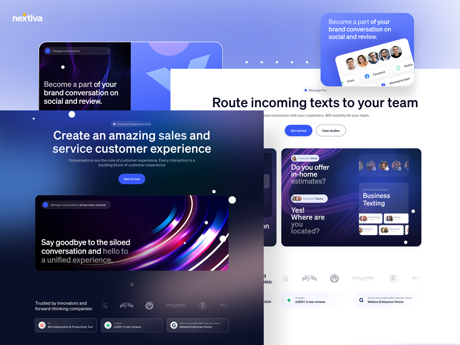
Wireframing & Iteration
Low-fidelity wireframes were used to test:
- section flow
- headline hierarchy
- CTA placement
- information grouping
Iterations were reviewed internally before moving to high-fidelity UI.
Responsive Design Optimization
Given the scale of traffic across devices, responsive behavior was carefully designed:
- adaptive navigation
- stacked layout logic
- mobile CTA prioritization
- optimized readability on smaller screens
Responsive Design Optimization
Given the scale of traffic across devices, responsive behavior was carefully designed:
- adaptive navigation
- stacked layout logic
- mobile CTA prioritization
- optimized readability on smaller screens
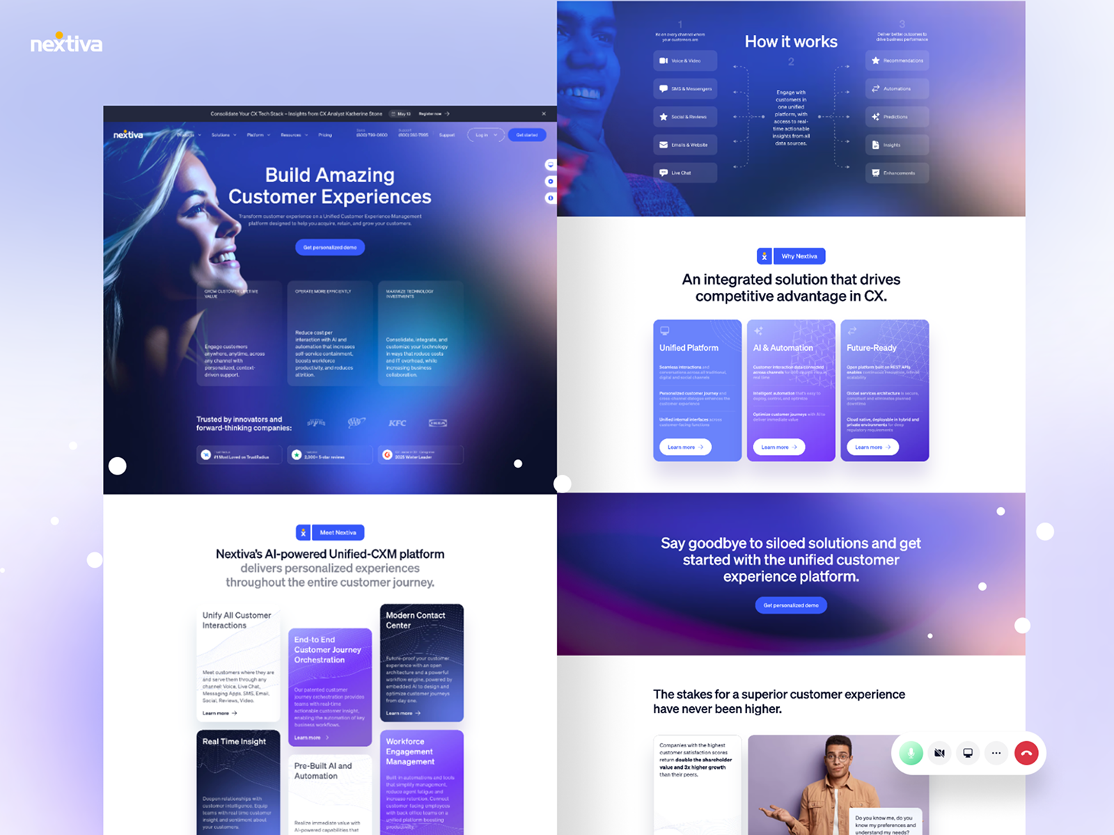
Outcome & Impact
The redesign resulted in:
- A modernized and cohesive visual identity
- Improved clarity across complex product offerings
- Simplified navigation and improved content structure
- A scalable layout system for future growth
- Better cross-device usability
The new design elevated the brand perception while supporting business and conversion objectives.

Previous
Lufthansa Cargo
Next

PCS Systemtechnik GmbH

© 2026 djokicnenad. Designed and crafted in


Figma